
The encounter
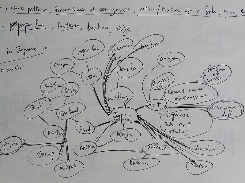
The brief
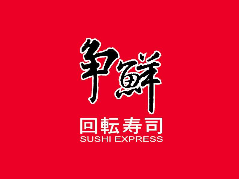
Their previous logo
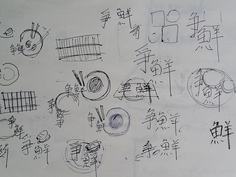
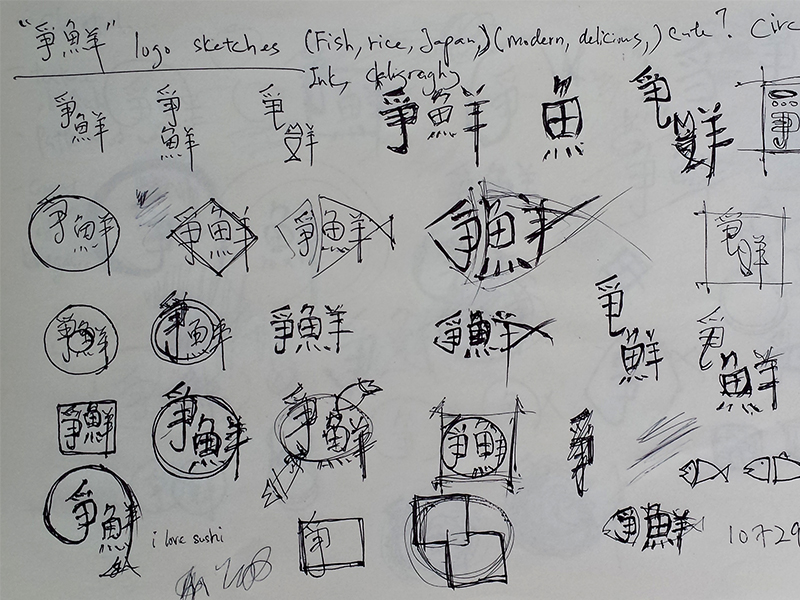
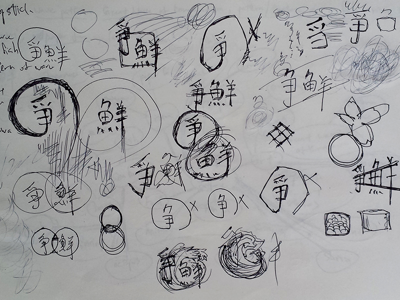
The sketches
The concept
Instant
I think a food logo should be straight forward without sacrificing the design aesthatic. My idea is to have a direct visual message for people who is hungry and seeking for nice sushi meal. Therefore the logo should be able to instantly capture upon first sight.
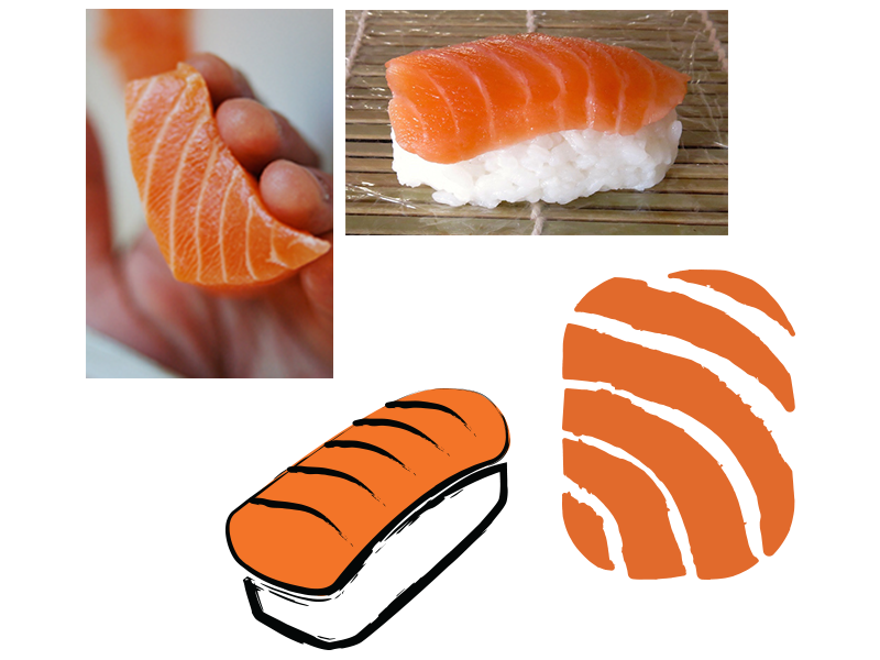
Salmon
After some consideration, I decided to choose salmon as a symbol of a Japanese sushi restaurant, direct enough the only concern is to make it visually appealing.
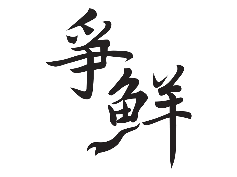
爭鮮 logo, the word “魚” (fish) is made to look like a fish with the tail added at the bottom.
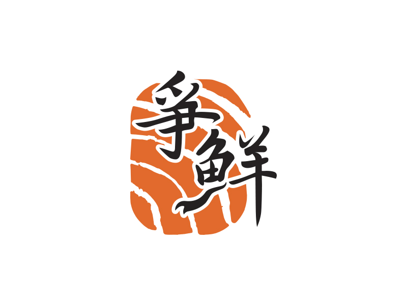
The final outcome
A simplified pattern or texture of a salmon fish as th background, this logo embodies a simple and direct message of a sushi restaurant to people.
Sushi Express logo
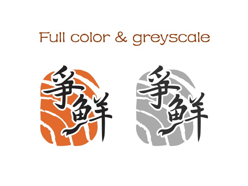
Sushi Express full color and greyscale logo
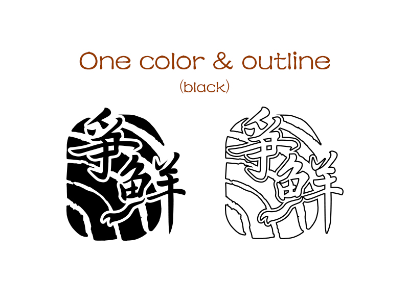
Sushi Express one color and outline logo (black)
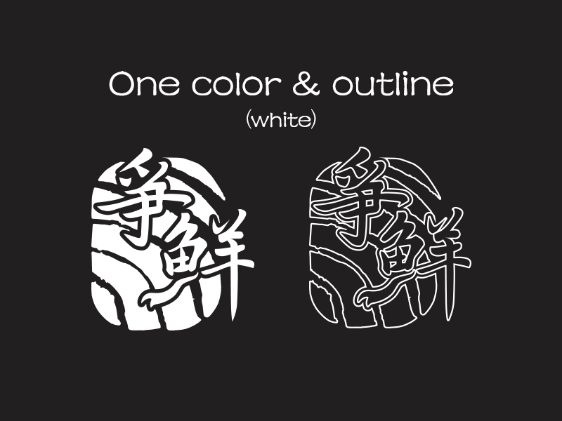
Sushi Express one color and outline logo (white)
Sushi Express logo
*The design did not got selected in the end.