
The encounter
The brief
The sketches
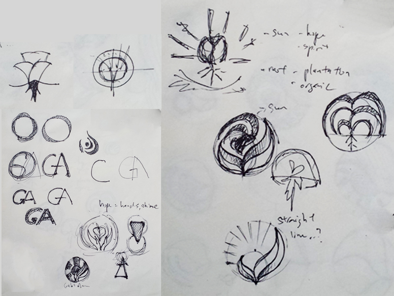
As always, doodling without a clear direction but “positive” keywords in mind
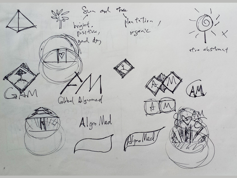
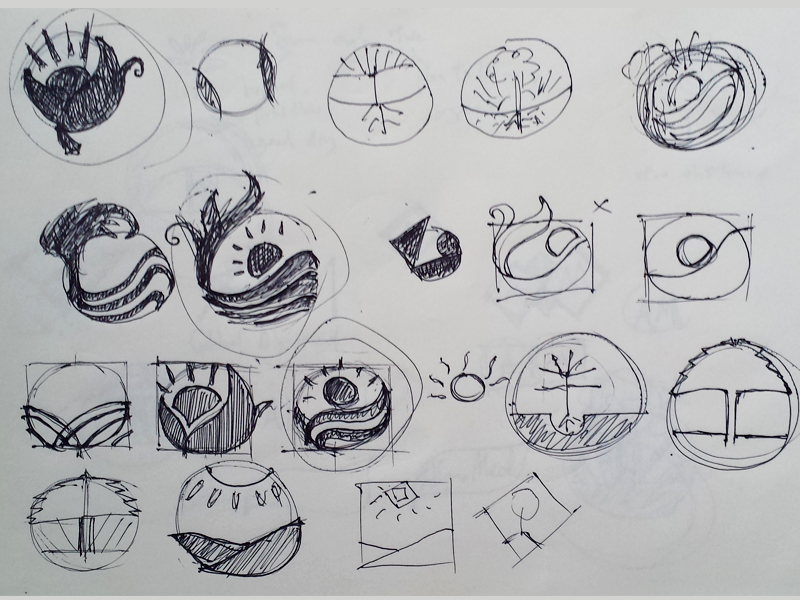
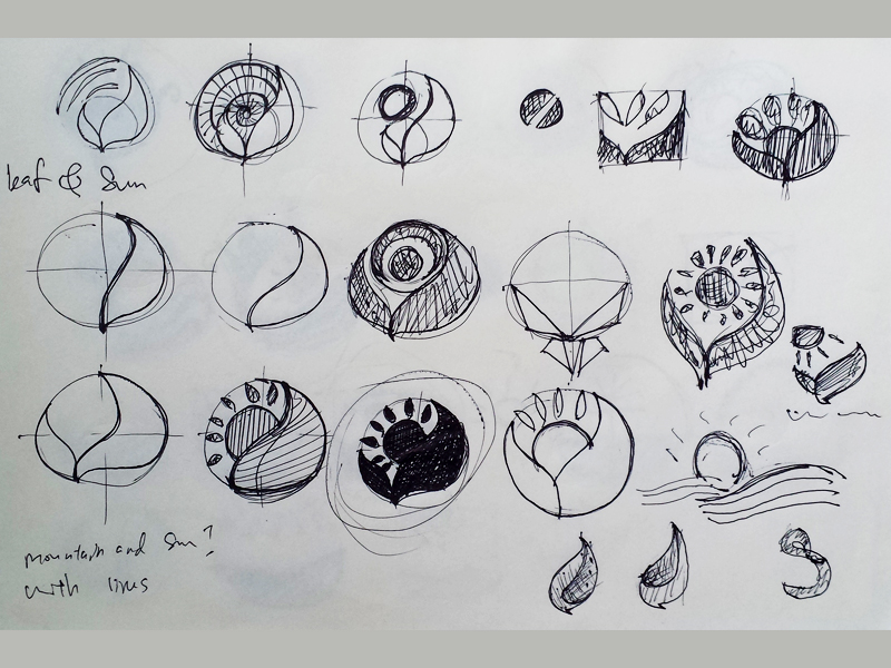
The concept
Sun
A positive impression is essential for a new brand, especially a company that produce health product. The client needed a logo that symbolize hope, something people to look forward to, a brand new day, thus the sun was chosen as the symbol of hope.
I also need to include the business of a plantation company, hence I’ve decided to use leaves because it has a direct relation with plant.
Harmony in mind
For the design part, I thought of making a logo that would appears to be harmony with both the sun and leaves elements, therefore I decided to try the Golden ratio method for the first time.
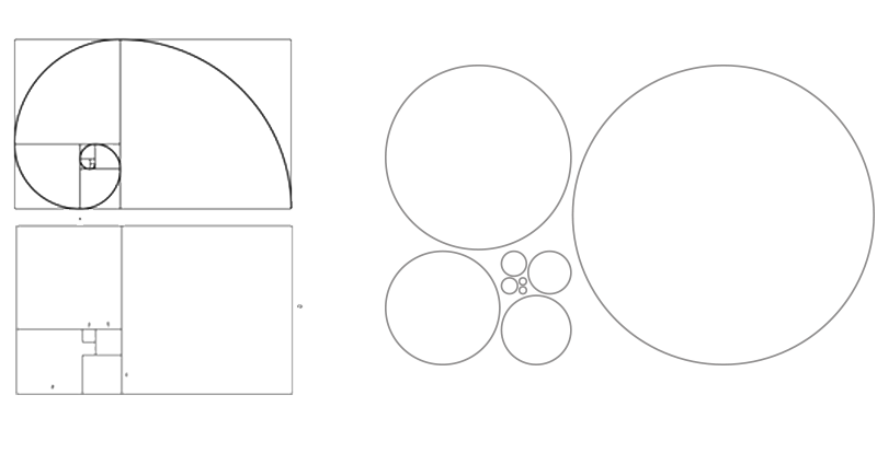
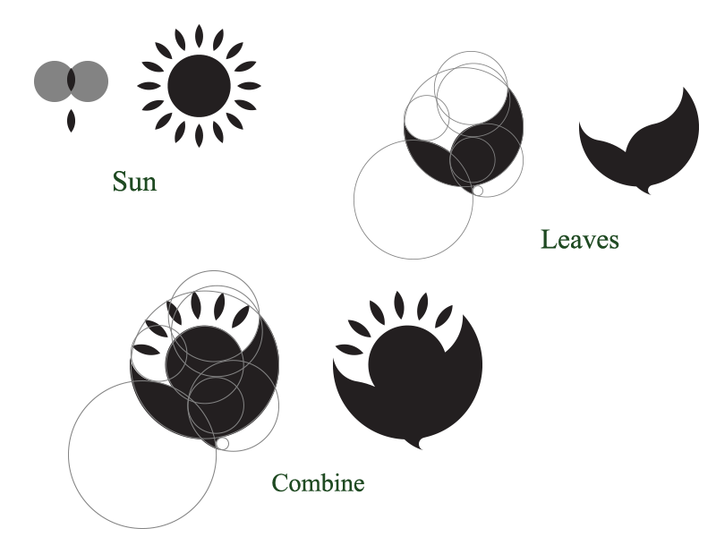
And then combine. Voila Global Algromed logo is created (well, not quite yet)
The final outcome
The final outcome after a little bit of tweaking on the gap between the sun and the leaves. The sun was stylized with layers of colors as well as one of the leaf. Serif font is used to indicate a formal look and feel of the company.
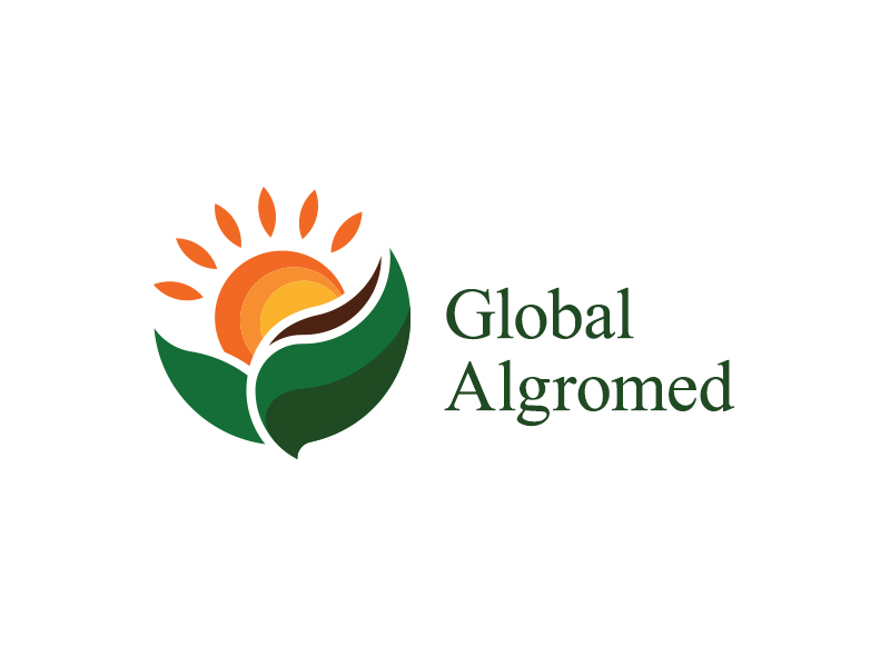
Global Algromed logo
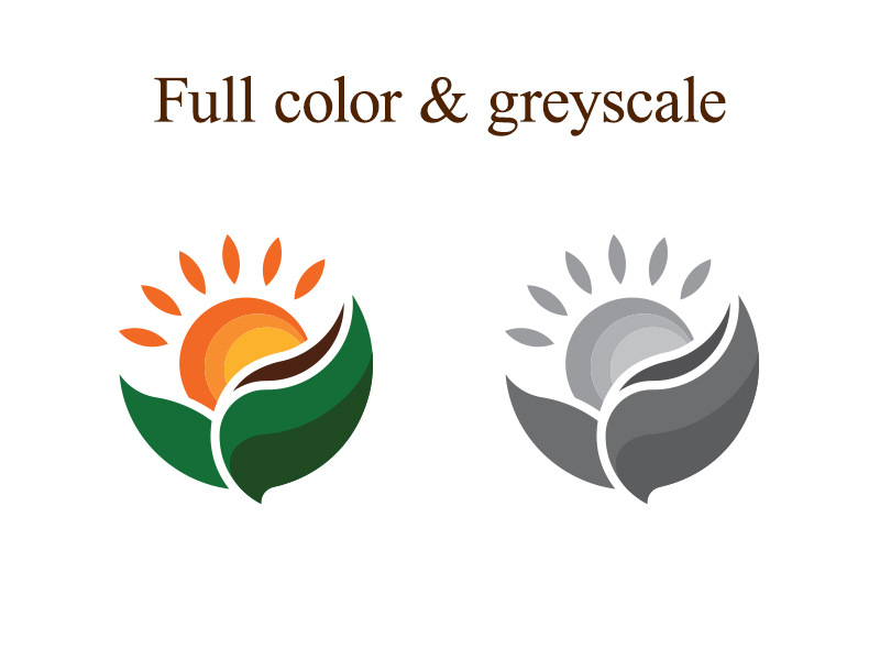
Global Algromed full color and greyscale logo
Global Algromed one color and outline logo (black)
Global Algromed one color and outline logo (white)

Global Algromed logo