The encounter
The brief
Their previous logo
Previous ESA logo
The sketches
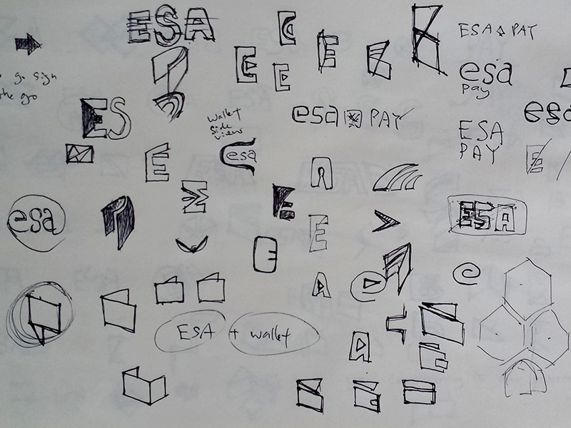
Logo type is a challenging job, you did want to screw up the basic propotion of the text when designing it.
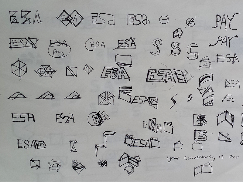
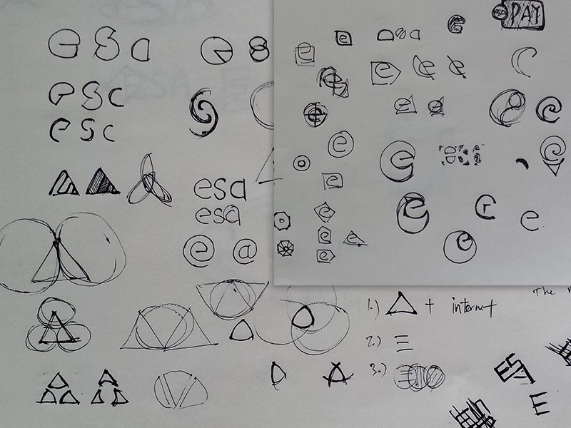
As I sketch, I was planning on making a symbol besides the logo type, there should be a standalone logo.
The concept
Minimalistic
Minimalistic design is what came in mind to achieve a brand new outlook for today’s design.
Simply sync
As seems that the lowercase text fits well together well than capital letter in terms of shape.
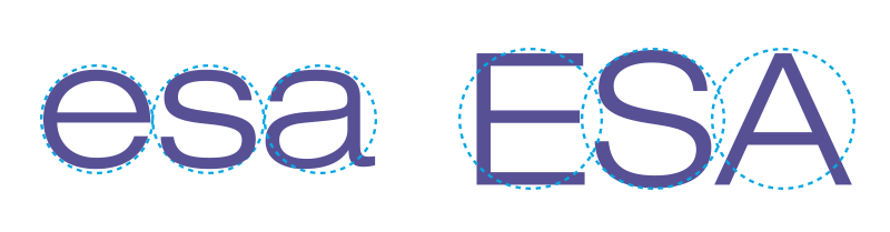

Chosen a font that almost look round overall.
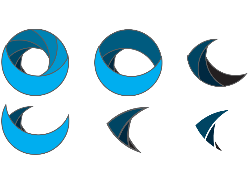
The upward arrow transformation was formed on several circles combined, cut, and arranged to ensure that it stays proportionate.
The final outcome
The “esa” color remained as near as the previous logo and added an upward arrow besides the letter “e”, different layers color of green is chosen to match the deep blue. The arrow is simply symbolising “up” for the services provided.
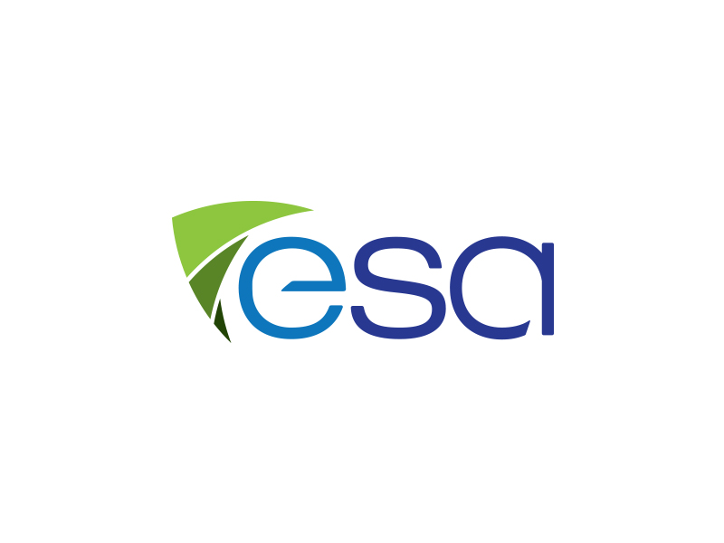
esa logo
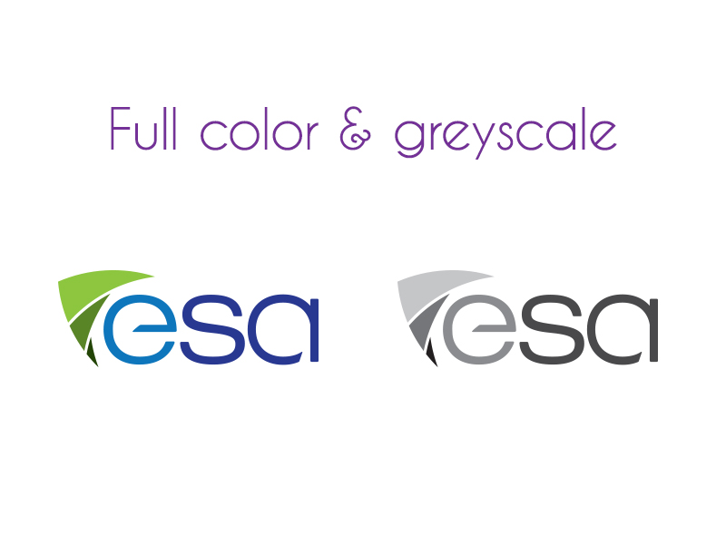
esa full color and greyscale logo
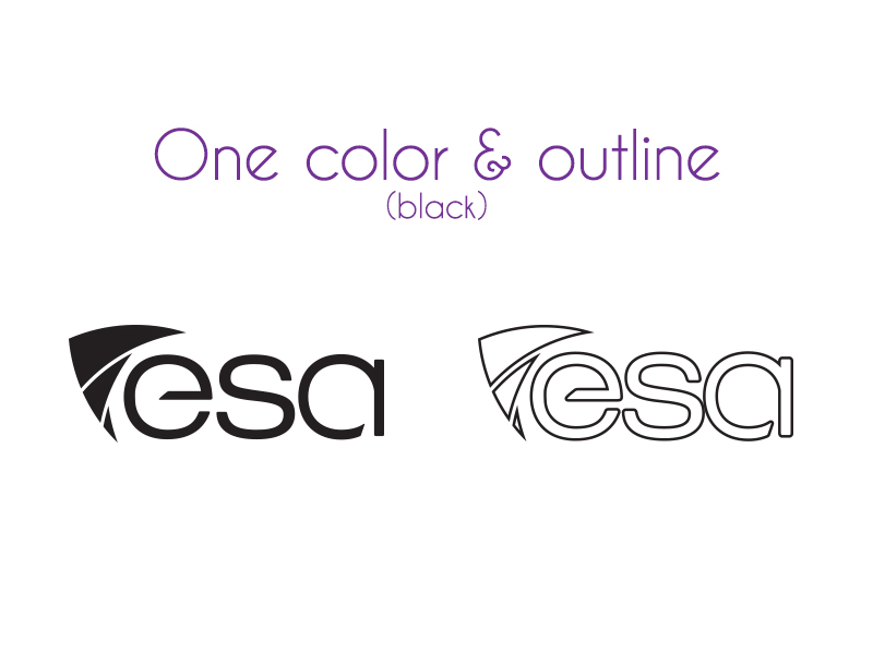
esa one color and outline logo (black)
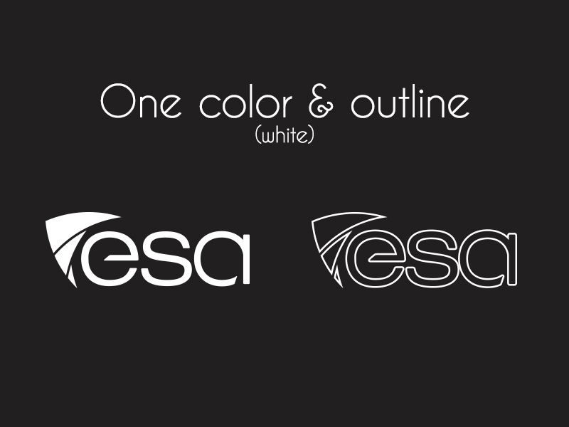
esa one color and outline logo (white)
esa logo
*Company name needs to change due to certain level of similarity with a name found in Quran.